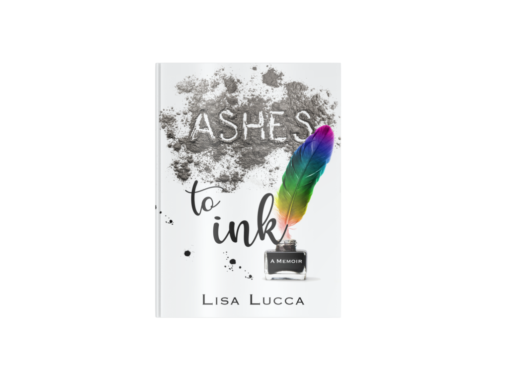
A good book cover doesn’t explain your story. It invites someone into it.
That difference matters more than most self-publishing authors realize. Your cover is not a summary. It is not a mood board. It is not a collage of meaningful symbols from chapter twelve.
It is a sales tool.
And in today’s publishing landscape, especially on platforms like Amazon and IngramSpark, your cover is often doing 90 percent of the heavy lifting before anyone reads your description.
Book Covers That Sell Do Three Things Well
The covers that consistently sell books are not always the most artistic or intricate. They are not necessarily the most colorful. And they are rarely the most complicated.


They communicate three things clearly and quickly:
- Genre
- Tone
- Professionalism
Let’s break that down.
Genre clarity means a reader can instantly tell whether your book is a thriller, a memoir, a devotional, a business guide, or a romance. Readers are pattern recognizers. They have internal expectations about what books in each category look like. When your cover aligns with those expectations, it signals safety. When it doesn’t, it creates hesitation.
Tone tells readers how they will feel. Is this dark and intense? Light and hopeful? Academic and structured? Personal and reflective? Tone is communicated through typography, color, spacing, and imagery working together.
Professionalism is trust. Clean alignment. Balanced spacing. Intentional typography. These details signal that the book has been handled carefully. And readers equate visual care with content quality.
If your cover communicates those three elements clearly, you are already ahead of most self-published books in your category.
If you are still planning your release window or positioning, it is worth reading Starting the Year Off Right, What to know before designing your book on the blog. Strategic decisions made early almost always lead to stronger covers later.
Why Clarity Beats Cleverness
Self-publishing authors often want their cover to stand out by being different. Different is not the same as effective.
A common mistake is trying to visually “explain” the entire book on the cover. Multiple images. Symbolism layered on symbolism. Quotes. Taglines. Subtitles. Decorative flourishes.
The result is usually visual noise.
Clarity wins because readers are making fast decisions. They are scrolling on their phone. They are glancing at thumbnails. They are comparing ten books in the same category side by side.


A clear cover:
- Has a dominant focal point
- Has readable typography at small sizes
- Limits itself to one strong idea
If you want a deeper look at preparing before design even begins, Avoiding Book Design Pitfalls, covers the strategic groundwork that makes covers stronger from the start.
What Doesn’t Work on Book Covers
Let’s talk about the most common design missteps that hurt book sales.
Overcrowding
Too many images competing for attention create confusion. When everything is important, nothing is important. A strong cover chooses a single primary visual idea and supports it.
White space is not emptiness. It is emphasis. It allows your title to breathe. It creates hierarchy. It makes the cover feel intentional rather than assembled.
Tiny or Overly Decorative Text
Your title must be readable at thumbnail size. If readers have to zoom in to understand what your book is called, they won’t.
Decorative fonts can also backfire. They may look interesting at large size but become illegible when scaled down. Typography should enhance your message, not complicate it.
Trying to Appeal to Everyone
This one is subtle.
Authors sometimes fear narrowing their audience. So they soften the cover. They remove intensity. They blur the edges.
But strong marketing requires specificity. A thriller that looks like a general fiction novel will struggle. A bold business book that looks timid will not inspire confidence.
You are not trying to convince everyone to buy your book. You are trying to attract the right reader quickly.
The Psychology Behind Selling Covers
Good design works because it communicates before the reader consciously analyzes it.
Color psychology plays a role. Dark, high-contrast palettes often suggest tension or authority. Light, warm tones may suggest hope or reflection.
Typography carries emotional weight. Serif fonts can feel traditional and authoritative. Clean sans-serif fonts often feel modern and direct. Script fonts can feel intimate or personal, but must be used carefully.
Spacing and alignment also matter more than most people realize. Clean margins and consistent spacing create a subconscious sense of order and professionalism.
Readers rarely articulate these reactions. They simply feel them.
And when a cover feels trustworthy and aligned with their expectations, they click.
The Amazon Reality: You’re Designing for a Thumbnail First
Most self-publishing books are discovered online. That means your cover is first seen at two inches tall, sometimes smaller. This changes everything.
At thumbnail size:
- Small details disappear
- Complex images become muddy
- Thin fonts vanish
- Subtle color shifts flatten out
Strong covers rely on bold shapes, strong contrast, and simple composition so they remain recognizable at small scale. One simple test designers use is shrinking the cover down to the size of a postage stamp. If the title is still readable and the image still makes sense, you are on the right track.
If it turns into a blur, it needs refinement.
A Strong Cover Cannot Fix a Weak Foundation
Design can elevate strong content. It cannot replace it. If the manuscript is not edited, if the positioning is unclear, or if the target audience is undefined, the cover will struggle because it has no strategic direction to follow. That is why planning matters.
Before design begins, you should know:
- Your primary audience
- Your competitive category
- Your trim size
- Your release window
- Your distribution platforms
When those decisions are made early, the design becomes purposeful instead of reactive.
At JohnEdgar.Design, most projects begin with a consultation call to clarify these pieces before any artwork is created. It saves time, prevents frustration, and produces better results.
When Design Works, It Feels Effortless
The best book covers often look simple.
But that simplicity is intentional.
Every element has been weighed. Every spacing decision has a purpose. Every color has been tested for visibility and tone.
When a cover works:
- The title is instantly readable
- The genre is unmistakable
- The tone feels right
- The overall impression feels professional
And the reader moves from hesitation to curiosity in seconds.
Design is not decoration. It is communication.
And for self-publishing authors competing in crowded marketplaces, communication is what turns scrolling into sales.


