A surprising number of professional designers squint at their work. Not because they forgot their glasses, and not because they’re tired. It’s intentional. The technique is known as the Squint Test, and it’s one of the simplest ways to determine whether a book cover will actually perform in the modern marketplace.
If you are a self-publishing author, this small design trick can reveal more about your cover’s effectiveness than hours of staring at it up close. The truth is that most readers will never see your cover the way you do. They will see it small, often on a mobile screen, surrounded by dozens of other covers, and usually while scrolling quickly. In those moments, clarity matters far more than cleverness.
The Moment Readers Actually See Your Cover
Most authors imagine readers encountering their book the way they themselves do during the design process. The cover appears full-size on a monitor or in a printed proof, where it can be examined carefully. Every detail is visible. Every design decision feels important.
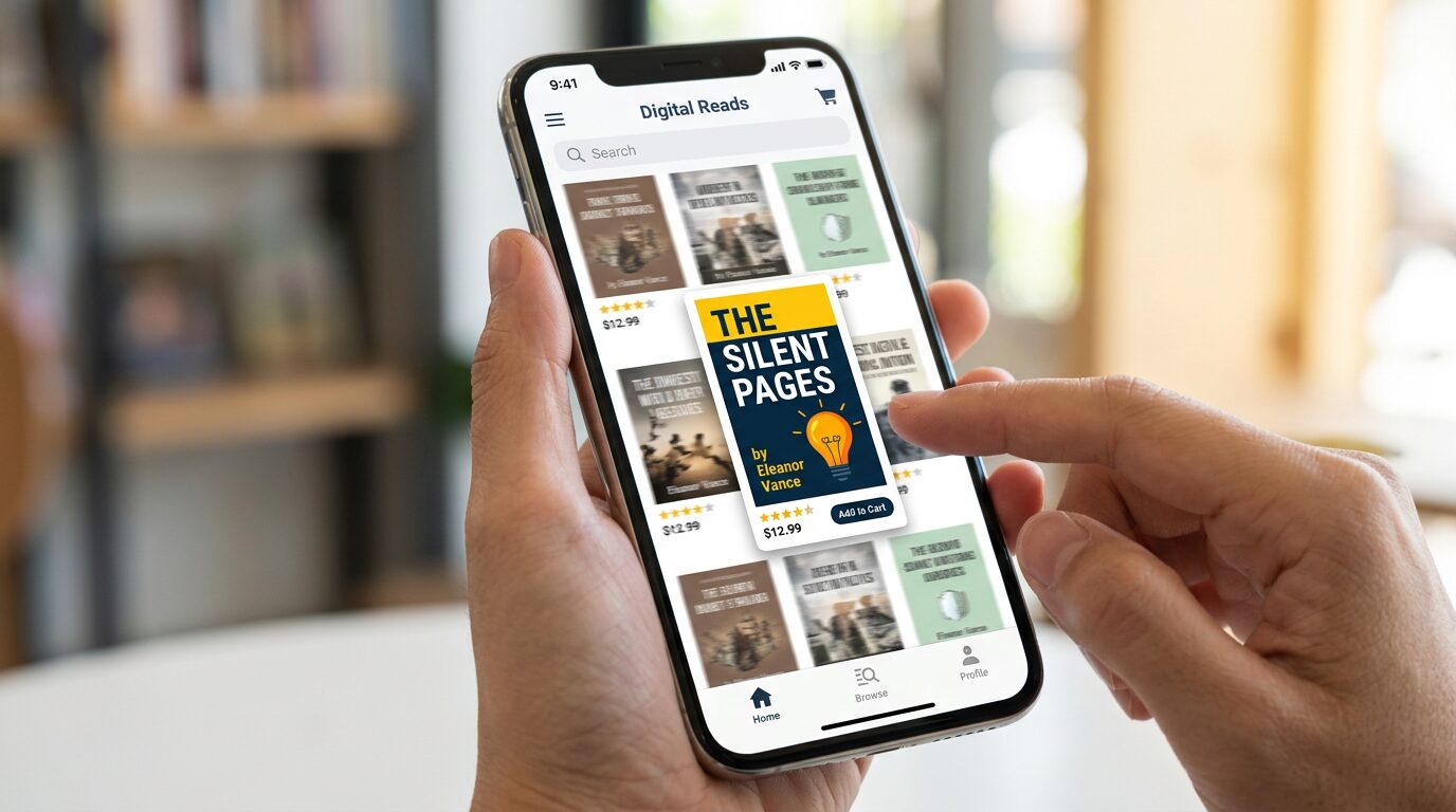
But in reality, most readers meet your book somewhere else first. They encounter it on an Amazon search page, a category listing, a social media post, or a recommendation grid filled with competing titles. In those environments, your cover may only be two inches tall, if that. It is often viewed on a phone screen while someone scrolls past dozens of other options.
In fact, most first impressions of your cover happen in places like:
- Amazon category pages
- Mobile search results
- Email newsletters
- Social media posts
- Online advertisements
This means the first impression your cover makes is rarely thoughtful or deliberate. It is quick and instinctive. If your design only works when someone studies it closely, it is already at a disadvantage. The Squint Test exists to simulate that quick glance and reveal whether your cover still communicates when details disappear.
What Is the Squint Test?
The Squint Test is exactly what it sounds like. You look at your book cover and squint your eyes until the details blur. Fine lines, textures, and small decorative elements begin to fade away, leaving only the strongest parts of the design visible.
When you do this, a few key things should still stand out. The title should remain readable. The main visual element should still be recognizable. The contrast between elements should feel clear, and the overall structure of the cover should still guide the eye naturally from one element to another.
When a cover passes the Squint Test, these elements remain visible:
- A readable title
- A clear main visual
- Strong contrast between elements
- A simple visual hierarchy
In other words, the cover should still communicate its basic message even when the details vanish. If it does not, then those details were doing too much of the work.
Why the Squint Test Matters More Than Ever
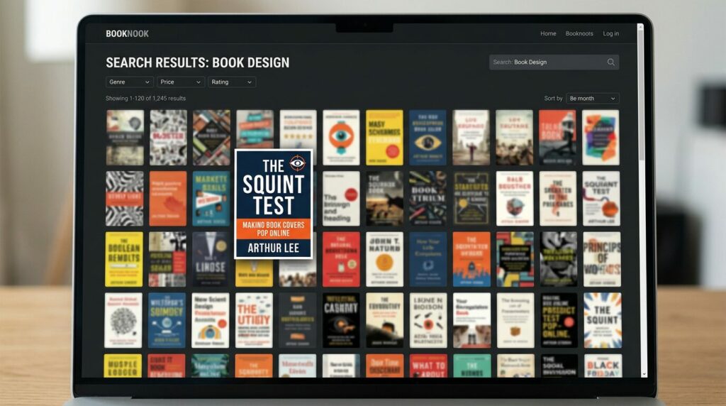
The Squint Test has become increasingly important because of the way readers discover books today. In the past, many covers were first encountered on bookstore shelves where they could be picked up and examined closely. Now, most discovery happens online.
Readers browse books through Amazon category pages, email newsletters, social media posts, and recommendation lists. In nearly all of these situations, the cover is shown at a very small size. A potential reader may only see it for a fraction of a second before deciding whether to click.
Human perception is remarkably fast. Our brains recognize shapes, contrast, and patterns before we consciously read words. If your cover communicates those elements clearly, it has a chance to catch attention. If it doesn’t, readers move on without realizing why.
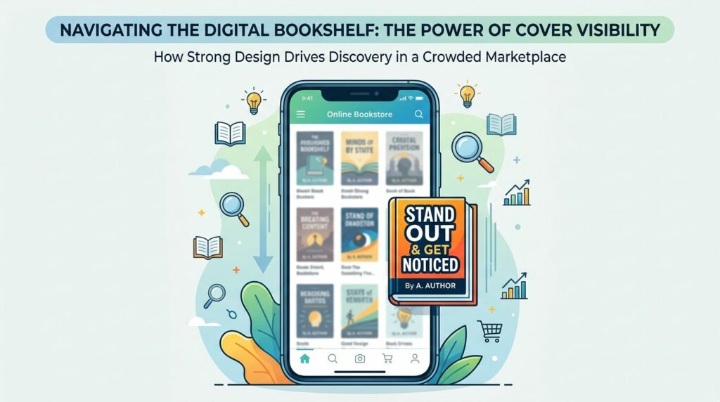
In other words, modern book covers must succeed in three environments:
- Thumbnail view on online stores
- Scrolling view on mobile devices
- Full-size view when someone clicks to learn more
Designers often say that a cover must work as a thumbnail first and as a piece of artwork second.
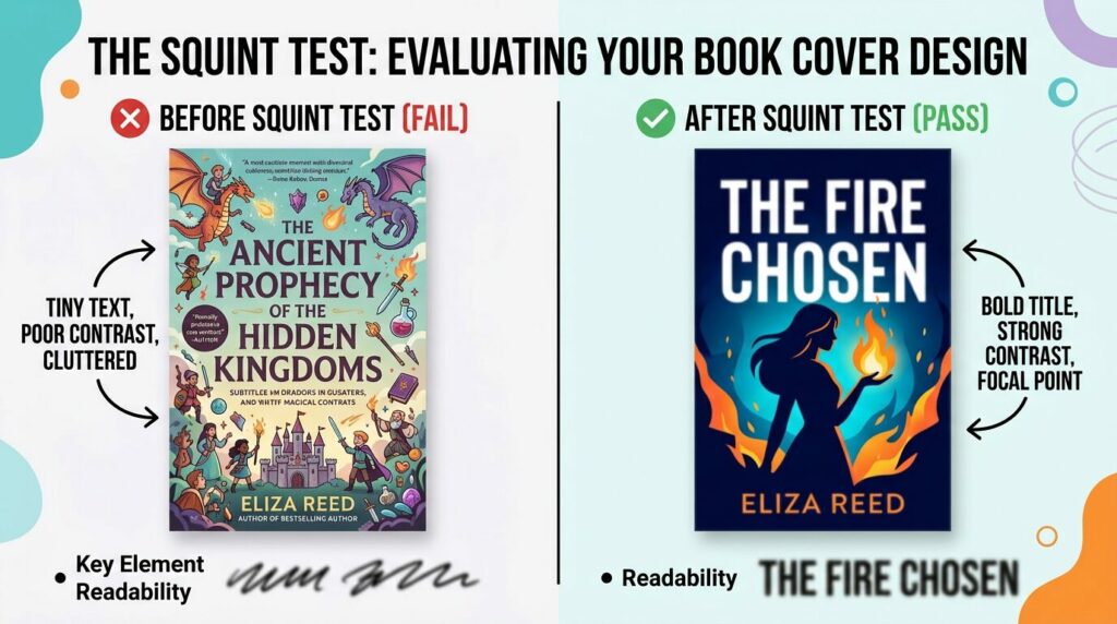
What Disappears When a Cover Fails the Squint Test
When a cover does not pass the Squint Test, several common issues usually reveal themselves. One of the most frequent problems is text that is simply too small. Authors often try to include subtitles, taglines, or descriptive phrases that shrink the title itself. When the cover is reduced in size, those words disappear entirely.
Another common problem is overcrowding. When too many images compete for attention, the eye does not know where to look. Characters, landscapes, symbols, and text can blend together into visual noise. Instead of guiding the reader, the cover creates confusion.
Weak contrast can also cause elements to vanish when the design is viewed at a distance. Text placed over a background that is too similar in color becomes difficult to read. Subtle color shifts that look beautiful up close may flatten out when the cover is small.
Decorative fonts present another challenge. While stylized lettering can add personality, it can also become illegible when reduced. A font that works beautifully on a printed poster may fail completely when viewed as a thumbnail.
Most failing covers struggle because of one or more of these issues:
- Tiny or compressed title text
- Too many images competing for attention
- Weak contrast between text and background
- Decorative fonts that lose legibility
- Overly busy layouts
Finally, cluttered layouts often struggle the most. Without a clear focal point, the reader’s eye wanders across the cover without settling on anything meaningful.
What Survives the Squint Test
Covers that perform well tend to share several characteristics. The most obvious is bold typography. A strong title remains readable even when the viewer is squinting or when the cover is reduced to a small size.
Strong contrast also plays a critical role. Clear relationships between light and dark elements help the design maintain structure even when details blur. This contrast allows key elements to stand apart from the background.
Another common feature of successful covers is a single dominant image. Instead of competing visuals, strong designs focus on one clear idea that supports the theme of the book. This simplicity helps readers recognize the message immediately.
Effective covers typically include:
- Large, readable title typography
- Strong contrast between elements
- One clear focal image or symbol
- Clean composition with breathing room
- Clear genre signaling
Finally, effective covers maintain a clear visual hierarchy. The eye knows where to go first, second, and third. The title leads, the image supports, and the author’s name anchors the design. When these elements work together, the cover feels confident and professional.
The Psychology Behind It
Readers rarely think consciously about design choices, but they respond to them instinctively. Clean typography suggests professionalism and authority. Balanced spacing suggests care and attention to detail. Familiar visual patterns signal that the book belongs to a genre they recognize.
When a cover aligns with these expectations, the reader’s brain relaxes. The design feels trustworthy. Without realizing it, the viewer assumes that the content inside the book will be just as thoughtful as the presentation outside.
Readers subconsciously look for signals like:
- Professional typography
- Balanced spacing
- Familiar genre visuals
- Strong readability
This reaction happens quickly and subconsciously. A cover that passes the Squint Test communicates confidence even before a word of the description is read.
A Real-World Example
Imagine two thriller covers displayed side by side in an online search result. The first contains multiple blended images, several fonts, and a long subtitle. The second uses one bold image, strong typography, and clear contrast.
When both covers are reduced to thumbnail size, the first becomes difficult to decipher. The text blurs together and the imagery becomes muddy. The second remains clear and recognizable even at a glance.
In most cases, the second cover receives more clicks. Not because it is more artistic, but because it communicates more effectively.
How Self-Publishing Authors Accidentally Fail the Test
Most authors do not create confusing covers on purpose. The problem often comes from trying to include too much information. Authors care deeply about their stories, and it can be tempting to place every meaningful symbol or scene on the cover.
Others worry that a simple design might appear boring or too minimal. They add additional fonts, graphics, or decorative effects in an effort to make the cover feel more dynamic.
These instincts are understandable, but they often work against the goal of clarity. A cover does not need to explain the entire story. It only needs to invite the right reader to learn more.
Common mistakes self-publishing authors make include:
- Trying to show the entire story on the cover
- Adding too many fonts or graphic effects
- Shrinking the title to make room for other text
- Choosing decorative fonts over readable ones
The goal is not complexity. The goal is communication.
How Designers Use the Squint Test
Professional designers use several techniques to test whether a cover communicates effectively. One of the most common is simply zooming out until the design appears at thumbnail size. Designers also convert covers to grayscale to check contrast, or step away from the screen and view the design from across the room.
The Squint Test is part of this process. By intentionally blurring the details, designers can see whether the core structure of the cover is strong enough to stand on its own.
At JohnEdgar.Design, this type of evaluation is a regular part of developing covers for self-publishing authors. The goal is always to create a design that performs not only in print but also in the digital environments where readers first discover the book.
How Authors Can Test Their Own Covers
If you want to test your own cover, the process is simple. Shrink the cover image until it is about one inch tall. Then squint your eyes and observe what remains visible.
Ask yourself three questions. Can you still read the title? Can you recognize the genre of the book? Is there one clear focal point that draws your attention?
You can also follow this quick test process:
- Shrink the cover to thumbnail size
- Squint your eyes until details blur
- Check if the title is still readable
- Identify the main focal point
- Ask if the genre is clear
If the answer to any of these questions is no, the design may need adjustment. Often, small improvements in contrast, spacing, or typography can make a significant difference.
The Relationship Between Simplicity and Sales
Many successful book covers look surprisingly simple. This simplicity is not accidental. It reflects careful decisions about hierarchy, spacing, and visual focus.
Strong covers resist the urge to include everything. Instead, they highlight the most important element and allow the rest of the design to support it.
Successful covers often focus on:
- One strong visual concept
- Clear typography
- Immediate readability
- Strong contrast
This clarity makes the cover easier to understand at a glance, which ultimately increases the likelihood that a reader will click and explore further.
Final Thought: Covers Are Communication
A book cover is not simply decoration. It is a communication tool. It tells readers what kind of experience they can expect before they read the first line of description.
The Squint Test helps reveal whether that communication is clear or cluttered. When the details fade away, what remains should still guide the viewer toward the message of the book.
The best covers do not demand attention through complexity. They earn it through clarity.


