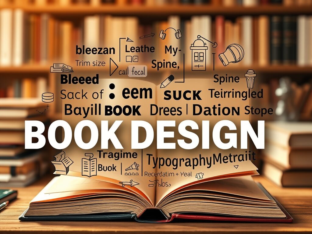
Standard Terms Used in Book Design
If you’re new to publishing or exploring the world of book design, you may come across unfamiliar terminology. Understanding these standard terms can help you communicate more clearly with designers and make informed decisions about your book’s production. Here’s a breakdown of key book design terms every author should know:
1. Bleed
Bleed refers to the area beyond the trim edge of a printed page. It ensures that images or colors extend to the very edge of the paper, preventing white borders after trimming. Designers typically extend artwork 1/8 inch beyond the trim line.
2. Trim Size
This is the final size of your book once it has been printed and cut. Common trim sizes for trade paperbacks include 5.5″ x 8.5″ and 6″ x 9″. Your trim size impacts everything from layout to printing costs.
3. Safe Zone (or Live Area)
The safe zone is the area within the trim size where important text and elements should be placed. Anything outside this zone risks being cut off during trimming.
Launch your book like a pro with our all-in-one Book Launch Kit—everything you need to plan, promote, and propel your book to success!
4. Spine
The spine is a book’s narrow, bound edge that faces outward on a shelf. Its width depends on page count and paper type, and it typically includes the title, author name, and sometimes the publisher’s logo.
5. Gutter
The gutter is the space between two facing pages in a bound book. Extra space is added to the inner margins to ensure that text isn’t lost in the fold.
6. Recto and Verso
In book design, “recto” refers to the right-hand page of an open book, while “verso” is the left-hand page. Typically, chapters begin on recto pages; knowing the difference is essential for layout planning and page flow.
7. Typography
Typography is the art and technique of arranging type. It includes font selection, sizing, spacing, alignment, and styling. Good typography enhances readability and contributes to a book’s tone.
8. Serif and Sans Serif Fonts
Serif fonts have small lines (serifs) at the ends of characters (e.g., Times New Roman), and are commonly used in print for body text. Sans serif fonts lack these lines (e.g., Arial) and are often used for headers or digital formats.
9. Justification
Justification refers to the alignment of text within a block. Fully justified text aligns evenly along both left and right margins, while left-aligned (ragged right) is also common for a more casual or modern look.
10. Orphans and Widows
These terms refer to stranded lines of text. An orphan is a single line of a paragraph at the top of a page, while a widow is a single word or short line at the end of a paragraph that appears alone at the top or bottom of a page.
11. DPI (Dots Per Inch)
DPI measures the resolution of images. For print, 300 DPI is the standard for high-quality images. Using lower-resolution images can result in blurry or pixelated prints.
12. CMYK vs. RGB
CMYK (Cyan, Magenta, Yellow, Black) is the color model used for print. RGB (Red, Green, Blue) is used for digital screens. Always use CMYK for print design to ensure accurate color reproduction.
13. Cover Spread
A cover spread includes the front cover, spine, and back cover as one continuous layout. Designers use this to ensure that all elements align correctly across the full exterior of the book.
Need a Professional Book Design?
Make your book stand out with a stunning cover and flawless formatting! I offer expert book design services to ensure your work looks polished and market-ready.
Contact me today to bring your vision to life!
14. Endpapers
These are the pages glued to the inside covers of hardcover books. They can be plain, decorative, or contain maps, illustrations, or other content.
15. Interior Layout (Typesetting)
Typesetting refers to the arrangement of text and images within the book’s interior pages. It involves careful attention to spacing, margins, chapter headings, and overall flow.
16. Print-on-Demand (POD)
Print-on-demand is a publishing method where books are printed only when ordered, rather than in bulk. POD services often have specific file requirements for both covers and interiors.
Conclusion
Learning the language of book design helps authors become more confident and informed during the publishing process. Whether you’re self-publishing or working with a professional designer, knowing these terms will make collaboration smoother and ensure your book looks as polished and professional as possible.


